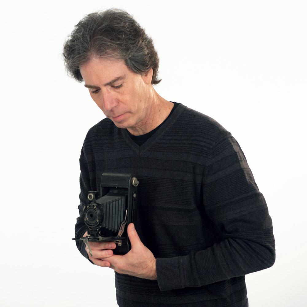
PRODUCERS In Focus: Featuring Kirk
The great artist Dale Chihuly once said “I never met a color I didn't like.” I wish I had said that, but I completely agree!
Color grading was, for me, a natural transition in a career that started with a master's degree in still photography, moved into directing and editing the moving image for television, and now includes the title Senior Colorist (After 35 years in the business, the “Senior” part is compulsory).
The same thrill I remember watching blank pieces of photo paper come alive with color in a darkroom tray is a feeling I get to relive every day as a colorist, still in a dark room, and still absorbed in a process visually exciting and rewarding. And in today's world of digital intermediate color grading, with huge 8K files and state of the art cameras, software, and fully integrated multi-function finishing and grading panels, (mine has 202 buttons and knobs, but who's counting?) we have vastly more control over how a scene looks and what mood or emotion is communicated than making a single exposure to light sensitive photo paper.
Now, we have the freedom to combine multiple exposures in one scene for high dynamic range, selectively modify colors individually, and adjust light and contrast to help illicit the desired response in the mind of the viewer. Infinitely adjustable Sapphire and Tiffen plug-ins allow me to apply film emulsion tonalities, add texture, light, glows and a multitude of other effects to craft a really unique look.
It all sounds very complicated. So, how do we start? Especially knowing the way we perceive color is so very subjective. Just as we have no way of knowing how a glass of cabernet tastes to another person, no two people will get the same feeling from a deep blue sky at dusk or a highly saturated red Toyota Camry. I've found it's best to start by just talking about how we want the scenes to look. Do we just want the shots to look beautiful? Dripping wet with saturated colors? Or does a moody, low-level scene better communicate the message? Real, surreal, or a combination of the two? It helps to set a number of looks and pick one to serve as a template. We can always change it later, but now we have a beginning.
My favorite button of the 202 on my panel is labeled “bypass.” I call it the “before and after button,” and it reminds us how far we have come in the grading process. It gets a lot of “What a difference!” comments. I really like it when grading can elevate a scene, sometimes even to the point where it becomes a favorite shot, when it started as a “client must-have.”
Singer-songwriter John Mayer says life is like a box of crayons. If so, I try to be one of the 64 box sets, rather than the 8-color boxes. Good color grading means not being afraid to use, or at least try, all the colors in the box. All the shades and tints, mixing and experimenting truly elevate the shot.
See examples of Kirk's work HERE
Give us a shout, we promise to exceed your expectations.
Executive Producer/Post Production: Karen Phillips: [email protected]
Producer: Kristen Wisemam: [email protected]
producers.tv
410-523-7520


